
Screen Elements
warning
This section is currently under construction. Please reach out if you require any assistance
Screen Elements can be added to the  Screen Canvas to display custom 2D content using
  Text,
Text,  Images, and
  Videos. Along with
  Buttons,
  Inputs,
 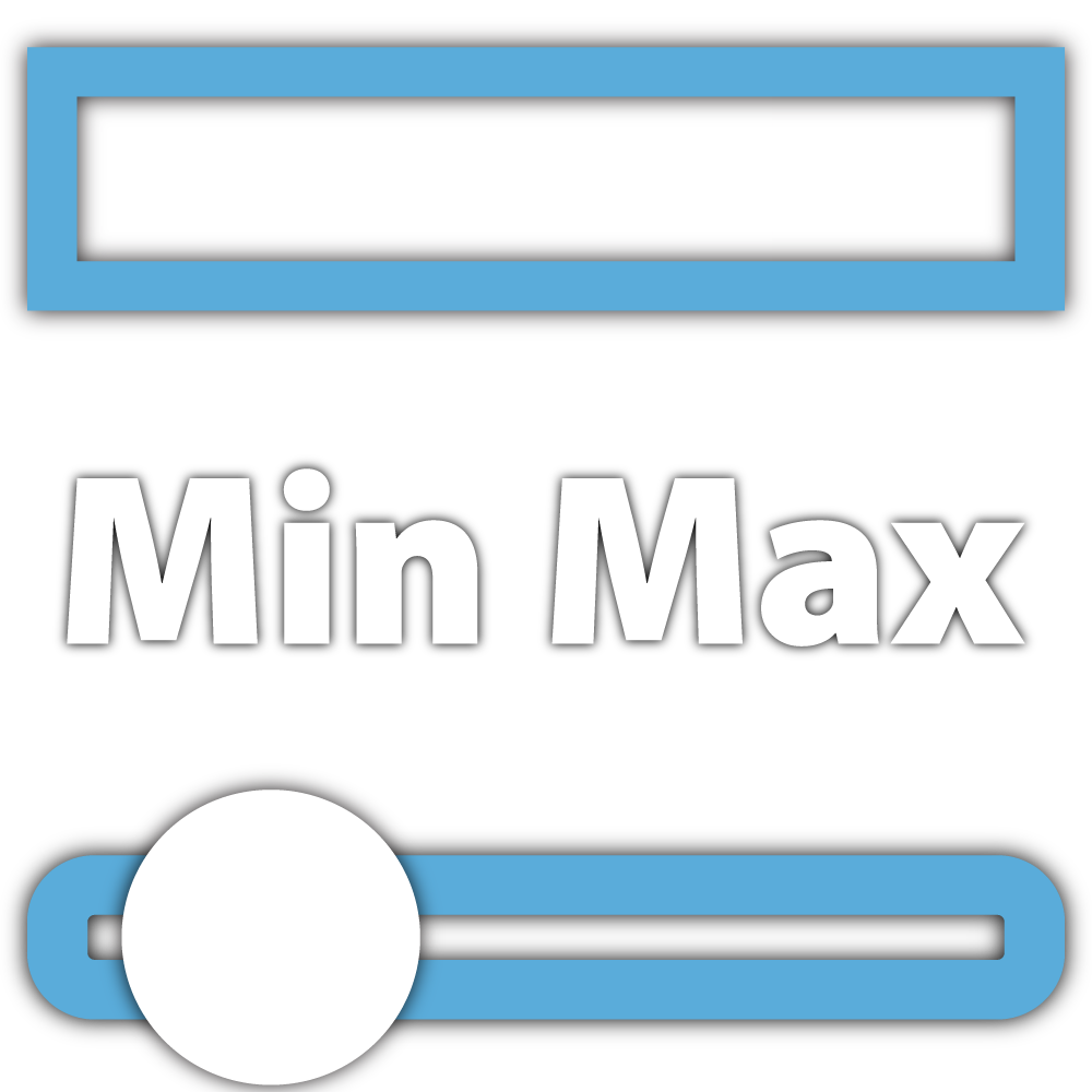 Ranges,
  Toggles and
 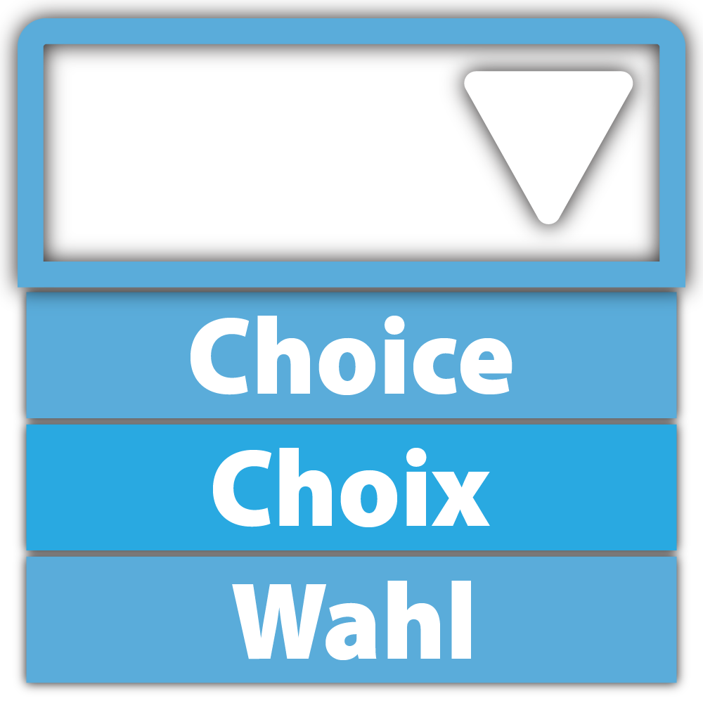 Dropdowns they allow you to add interactive components, capture participant input, and collect self-report data.
note
Screen Elements are rendered based on your initialization order. The most recently added Screen Element will render on top of others, potentially causing earlier-created Screen Elements to be hidden by more recently created ones, unless you manually change their order.Text
Text allows you to add and display static written content (e.g., letters, words, numbers, and special characters) with support for Rich Text Formatting (RTF) on your  Screen. For example, you can use Text to display instructions to participants or provide labels for
  Interactives. Each Text is composed of a rectangular 2D bounding box which you can resize at runtime using Runtime Size or using the Transforms.