
Designing Screens
 Canvas Settings
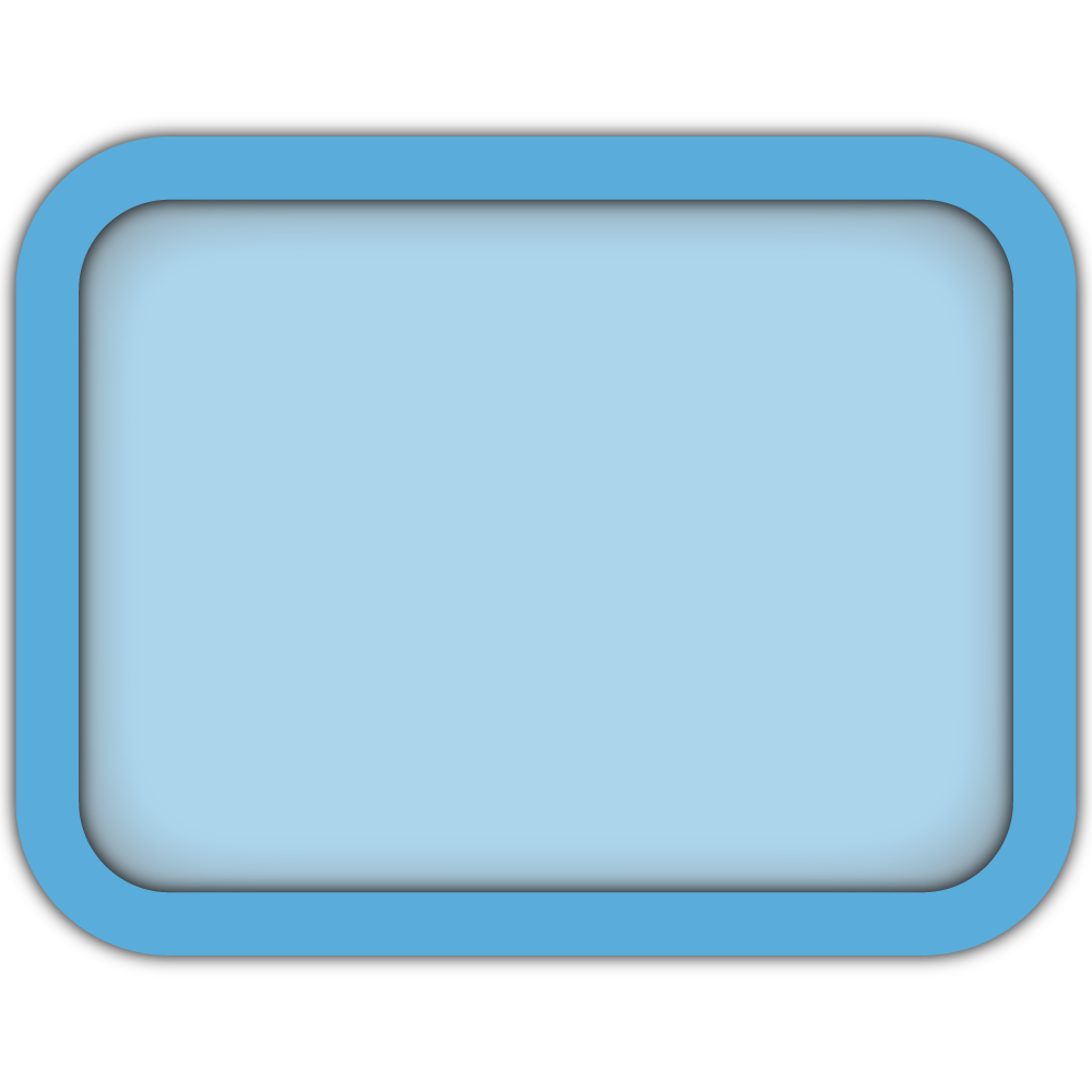
Canvas
Click the Canvas Show button to toggle the visibility of the Screen Canvas, which is the background for all Screen Elements. By default, the Screen Canvas is a visible black rectangle measuring 200 cm by 120 cm. Clicking this button will hide the Screen Canvas while keeping Screen Elements visible. This is useful for displaying Screen Elements without a background, such as an individual Button or an Image.

Text Element
Text allows you to add and display static written content (e.g., letters, words, numbers, and special characters) with support for Rich Text Formatting (RTF) on your Screen. For example, you can use Text to display instructions to participants or provide labels for Interactives. Each Text Element is composed of a rectangular 2D bounding box which you can resize at runtime using Runtime Size or using the Transforms

States
The Active State controls whether the Screen Element can be interacted with. For example, when a Range Element is Deactivated, it will not be possible to move the slider knob. Some Screen Elements, like Buttons also have Settings that allow you to change the Element's appearance depending on it's Active State.
 Creating Epochs by Adding a
 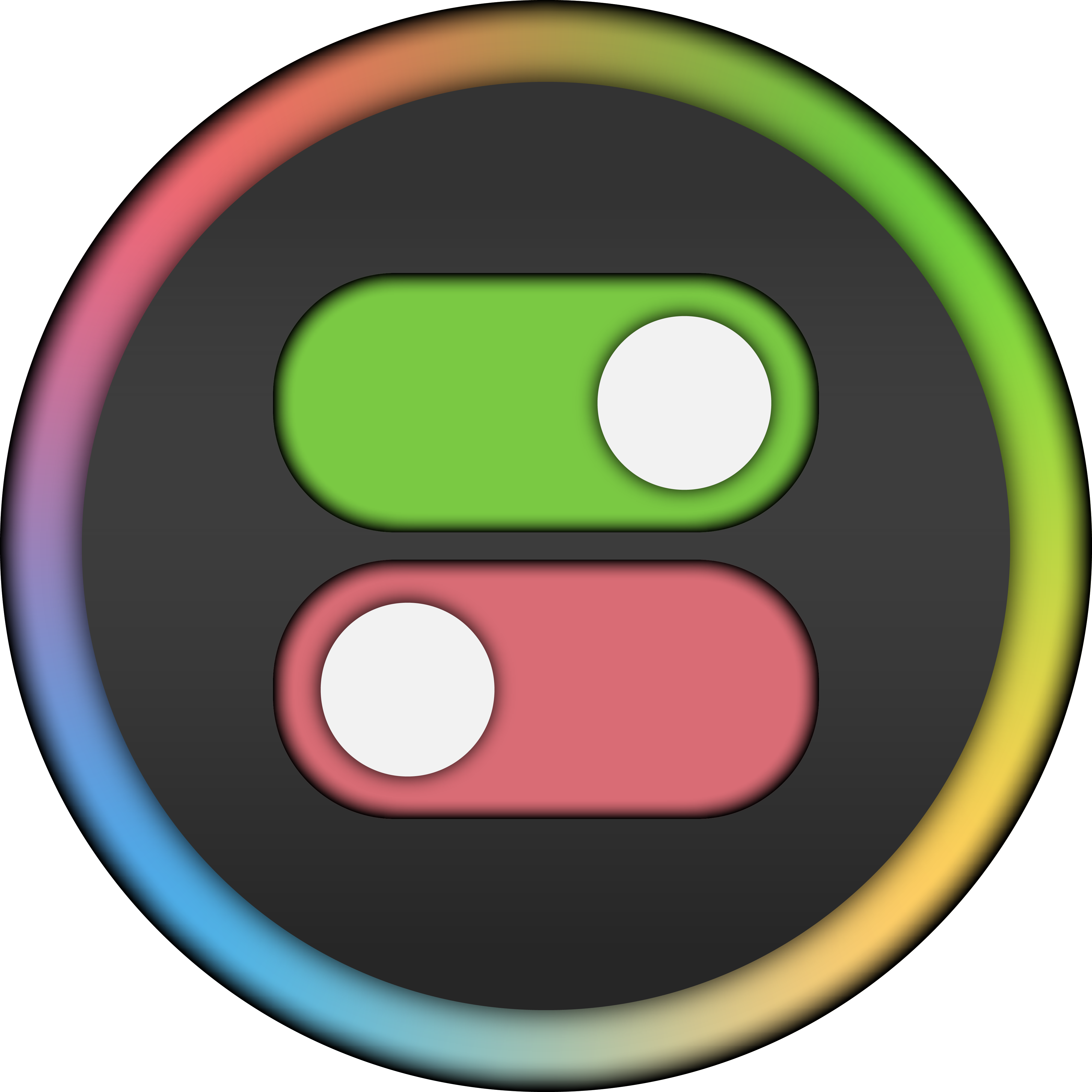 State Change to one of the Elements Event-Points or by creating a Conditional Event and adding a State Action to the one of the Conditional Event's Event-Points.